Using realistic mockups and real photography
to build credibility.
By Santiago Brandani
You finish a project for a client and the usual question pops up:
Is it even worth uploading it to Behance?
It can feel like a chore. But most of the time, it’s worth it.
Because when a presentation is well told, the project doesn’t just become easier to understand — it also has a better chance of standing out and reaching places you didn’t exactly plan for. That’s what happened to us with one of our recent projects, Pava.
If we’re honest, we often spend more time thinking about how a project will look on Behance than about the presentation we originally made for the client. And that actually makes sense. Behance is our shop window. It’s where other studios, designers, and potential clients get their first impression of what we do.
So it’s not enough for a project to be “well designed.”It has to be well presented.
And more importantly, it has to feel believable. Human.
How We Show It
Over time we realized the best way to present a project is to treat it like a visual story. Not in a dramatic way. Just giving it structure. Letting someone understand what it’s about, see the thinking behind it, and only then discover how it lives in the real world.
Showing everything at once rarely works. Revealing it step by step usually does. It gives people space to connect the dots on their own.

A Concrete Example: Pava
There’s no better way to explain this than with a real example. In this case, the branding we developed for Pava, a specialty coffee shop in Madrid. A presentation that, over time, ended up having more impact on Behance than we expected.
Start with just enough
We usually begin with a short piece of text that explains the concept. We know attention spans are short, so we keep it simple. Just enough to make sense of what’s coming next.
In this case:
"Pava is the kind of coffee shop that makes you want to stay. Simple, honest, and serving good coffee.
The industrial character of the neighborhood and its proximity to the river inspired the brand identity. As a tribute to its surroundings, a frog becomes the shop’s mascot, adding a playful and memorable touch to its visual personality."
That’s enough. The images should do the rest.
Since it’s a brand identity, we started by showing the logo and a few supporting illustrations. With just a handful of visuals, we were already reinforcing what we had described in words. The industrial feel. The textures. The frog that now makes sense because we gave it context first.

Why Realistic Mockups Matter
Once the basics are clear, it’s time to show the design in use. As designers, we know that many times we don’t have photos of the final production yet. That’s where mockups start to play a big role.
This is usually the fun part.
Mockups let us experiment. Adjust. Throw things away. Try again. Choose the image that explains the design best. They give us control, and that control matters when you’re building a narrative.
Not all mockups communicate the same thing.
A mockup chosen with intention, thinking about light, framing, textures and atmosphere, becomes part of the project. Not just a frame around it. When that happens, the work feels grounded. And when it feels grounded, people trust it more.
The more realistic the mockup, the better. Not because it needs to trick anyone, but because it doesn’t distract. It doesn’t make the viewer wonder if something feels off. It simply supports the story. In a moment where many visuals are AI-generated, realism often comes down to light, texture and physical coherence. People notice the difference, even if they can’t explain it.
We also use a lot of zoomed-in crops from the same image. Looking closer at texture, materials and small details. We’re not adding more content. We’re just slowing things down and letting people see better. That’s why when we build realistic mockups, we start from real photography and try to keep the same coherence a final production would have. Otherwise it shows. Even if only a little.

Mockups First, Photos Later
In Pava’s case, the presentation started with mockups and stayed open to adding real photos later. Even before we had them, we already knew how they would look. Direct flash. Dark backgrounds. Hard light. So we built the mockups using that same visual language.
When the real photos finally arrived, nothing felt disconnected. They didn’t interrupt the story. They continued it.

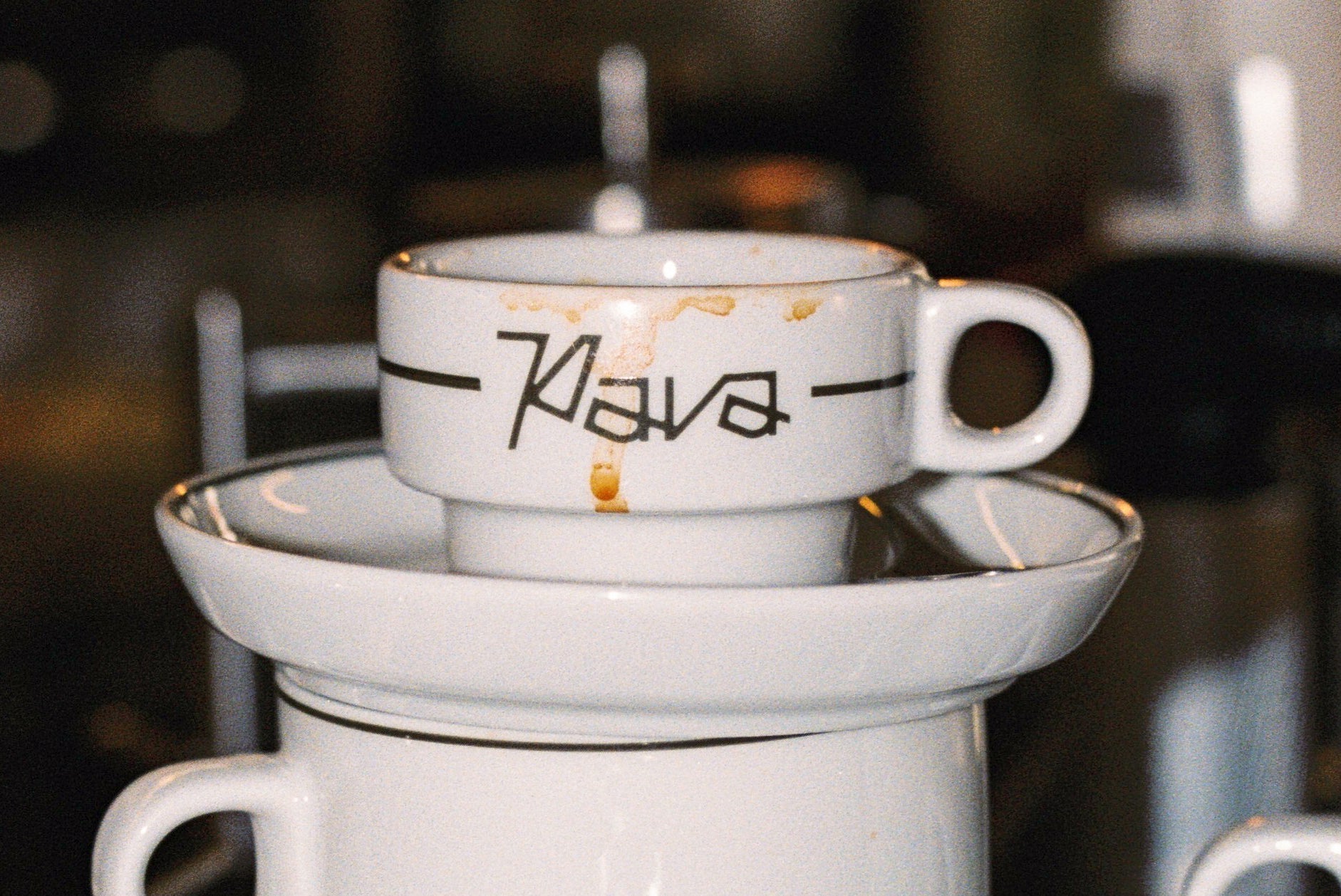
The Project Thumbnail
The thumbnail is often the project’s front door. In a crowded feed, it’s the image that decides whether someone clicks or keeps scrolling. Choosing it can be surprisingly hard. It’s the first thing people see, and sometimes the only thing.
We try to pick the image that summarizes the project best. Not the prettiest one. Not the flashiest.

For Pava, we chose an image that communicated three things at once:
-
the logo is clearly visible
-
the cup immediately signals it’s a coffee shop
-
the overall tone feels relaxed and unpretentious
If one image can communicate that much without explanation, it’s probably the right one.
Closing the Project
To close a Behance presentation, real photos from the client are key. They don’t have to be perfect. If the client sends photos taken on a phone, that’s fine. Using them is also a design decision. They add context, life, and a kind of honesty that polished images sometimes don’t.

If you're curious to see more, you can explore the full Pava branding project.
There’s no single formula for presenting a project on Behance.
But the presentations that work best are built on coherence. A sequence of images where nothing feels random.
When that narrative feels intentional, believable and human, the project tends to stand out on its own.